1.0 What Is An Analytics Dashboard? #
An analytics dashboard is a clear, visual tool that shows you key data about your business in one place. It helps you track important numbers like customer activity, reward usage, and point transactions — so you can make better decisions, faster.
For example:
- The Rewards Report shows how many rewards have been given out and used, with easy-to-read graphs and charts.
- The Customer Report gives insights into who your customers are, how often they log in, and how they engage with your business.
- The Points Report tracks how customers buy and use points, helping you understand spending trends.
The General Dashboard combines all this information into one view with interactive charts and filters. This makes it simple to see what’s working, spot trends, and find ways to improve.
Overall, an analytics dashboard gives you the data you need to grow your business, keep customers engaged, and run your operations more efficiently.
2.0 How To Access The Main Analytics Dashboard #
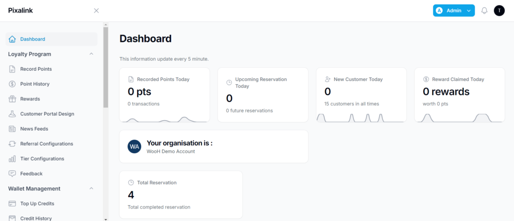
Step 1: Log in to your account. Once you’re logged in, you’ll arrive at the home screen. #
Step 2: Click the Admin button (blue box) located at the top right corner of the screen. #
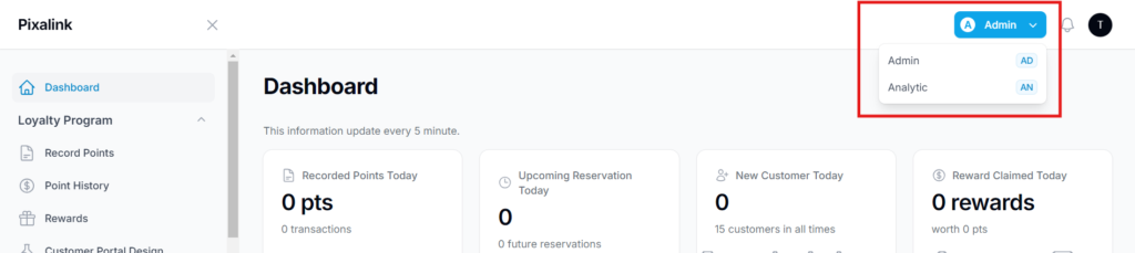
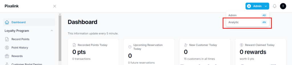
Step 3: From the admin menu, select the Analytics or An option. #
This will open the main analytics dashboard where you can view and explore your reports.
Step 4: Proceed to the main analytics pages to view detailed performance data and reports. #
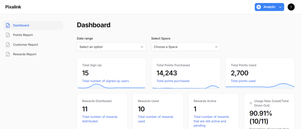
3.0 The dashboard features #
- Date range: Allows you to select a specific time period to filter and analyze your data.
- Select space: Enables you to choose the space or location you wish to view analytics for
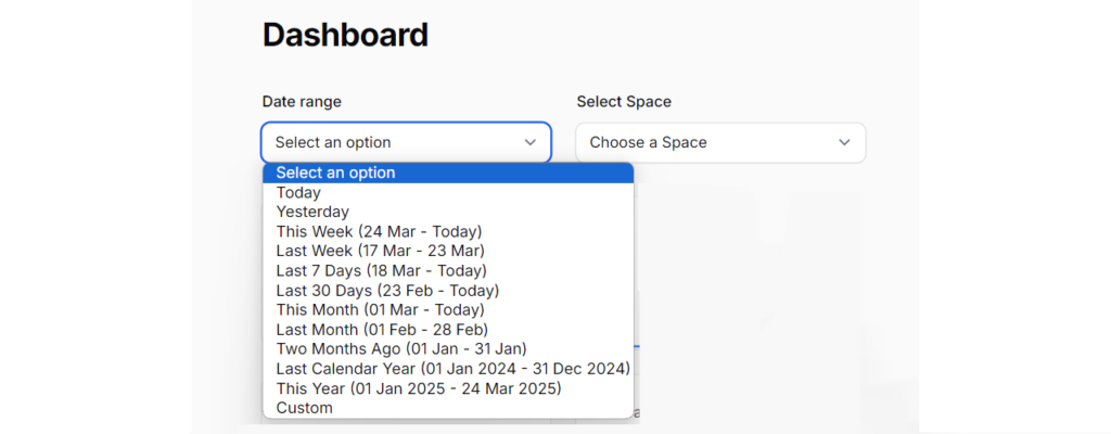
- The Date Range filter – Allows users to set a specific time frame for viewing data, whether for today, this week, last month, or a custom range.
- The Select Space filter – Enables users to view data for different branches, locations, or spaces as needed.
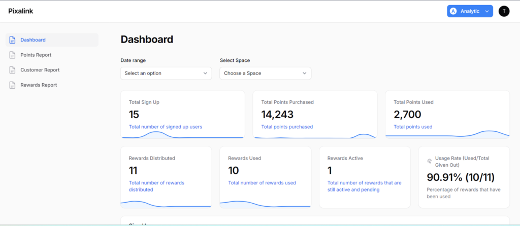
4.0 Key metrics overview (top section) #
- Provides a clear snapshot of your most important business performance indicators.
- This section helps you quickly monitor customer activity, reward usage, and overall engagement.
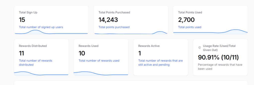
- Total sign-ups: Shows the total number of users who have registered.
- Total points purchased: Displays the total number of points bought by customers.
- Total points redeemed: Displays the total number of points used by customers.
- Rewards distributed: Shows the total number of rewards issued to customers.
- Rewards redeemed: Indicates how many rewards have been claimed and used.
- Active rewards: Shows the number of rewards that are currently active or pending.
- Redemption rate: Displays the percentage of rewards that have been successfully redeemed.
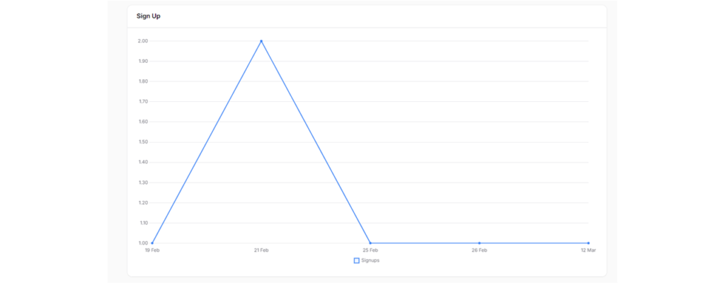
5.0 Sign-up trend (line chart) #
Shows the number of user sign-ups over time, making it easy to spot patterns, spikes, and growth trends.
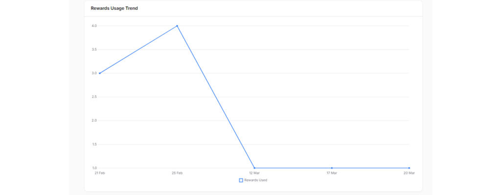
6.0 Rewards usage trend (line chart) #
Tracks how rewards are redeemed over time, providing clear insights into usage patterns and customer engagement..
7.0 Customer rewards status & number of rewards distributed (pie chart) #
Shows a breakdown of reward statuses and the total number of rewards given to customers, making it easy to understand distribution and usage at a glance.
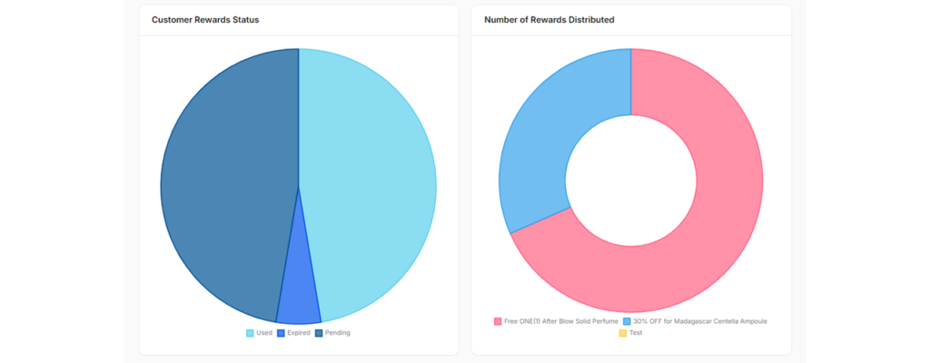
- Customer rewards status: Provides real-time insights into reward usage, showing which rewards have been redeemed, which are pending, and which remain available.
- Number of rewards distributed: Visualizes how various types of rewards have been issued to customers, making it easy to understand overall distribution at a glance.